1
/
of
6
Card Experiment
Edo Karuta (SHOGUN) Playing Cards
Edo Karuta (SHOGUN) Playing Cards
Regular price
$27.00 USD
Regular price
Sale price
$27.00 USD
Taxes included.
Shipping calculated at checkout.
Quantity
Couldn't load pickup availability
Edo Karuta Playing Cards takes a delightful detour into the world of street graffiti. Flagrant Agenda is all about that street culture vibe, particularly how graffiti can be a powerful medium for expression (who knew spray paint could be so profound?).
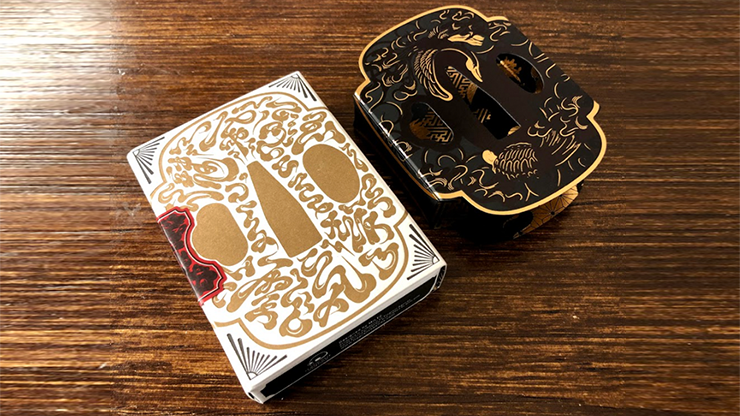
The star of the show here is the iconic Edomoji, a Japanese typographic style that reigned supreme during the Edo period. These beauties were all the rage for advertising and branding in the bustling trades that popped up before modern Japan took the stage. Stroll past any Japanese restaurant, and you’ll spot those Edomoji banners like a beacon of nostalgia. In Edo Karuta, these typographical gems overlap to create striking motifs, showcasing our designer (MILTZ)’s signature flair that you might recognise from the Shibuya Bluffiti project. Check out the card backs for some seriously eye-catching designs.
The Edo period was chosen—not by a random dice roll, mind you—as the thematic backbone of Edo Karuta. This era could be dubbed the golden age of pre-industrial Japan. Thanks to the Tokugawa Shogunate, Japan enjoyed a long peace, leading to a boom in the economy and a cultural renaissance. However, let’s not gloss over the isolationism and rigid societal hierarchy that also characterised this time—like a party with a strict guest list, but one where change was already brewing under the surface. Spoiler alert: the arrival of foreign powers blew the lid off that cosy setup, leading to a whirlwind of modernisation.
The aesthetic and thematic choices bring us full circle in terms of transformation. Edomoji represents the merchant class, the real winners of the Pax Tokugawa, who stirred the pot of change while the upper crust was busy toasting to their own success. On the surface, all looked peachy, but change was just around the corner, often arriving in the form of unexpected guests—like those black ships creeping over the horizon.
EDO KARUTA features:
The star of the show here is the iconic Edomoji, a Japanese typographic style that reigned supreme during the Edo period. These beauties were all the rage for advertising and branding in the bustling trades that popped up before modern Japan took the stage. Stroll past any Japanese restaurant, and you’ll spot those Edomoji banners like a beacon of nostalgia. In Edo Karuta, these typographical gems overlap to create striking motifs, showcasing our designer (MILTZ)’s signature flair that you might recognise from the Shibuya Bluffiti project. Check out the card backs for some seriously eye-catching designs.
The Edo period was chosen—not by a random dice roll, mind you—as the thematic backbone of Edo Karuta. This era could be dubbed the golden age of pre-industrial Japan. Thanks to the Tokugawa Shogunate, Japan enjoyed a long peace, leading to a boom in the economy and a cultural renaissance. However, let’s not gloss over the isolationism and rigid societal hierarchy that also characterised this time—like a party with a strict guest list, but one where change was already brewing under the surface. Spoiler alert: the arrival of foreign powers blew the lid off that cosy setup, leading to a whirlwind of modernisation.
The aesthetic and thematic choices bring us full circle in terms of transformation. Edomoji represents the merchant class, the real winners of the Pax Tokugawa, who stirred the pot of change while the upper crust was busy toasting to their own success. On the surface, all looked peachy, but change was just around the corner, often arriving in the form of unexpected guests—like those black ships creeping over the horizon.
EDO KARUTA features:
- Two colour schemes - The red/white Daimyo deck and the black/gold Shogun deck
- Printed by the United States Playing Card Company
- Traditional cut and magic finish
- Premium metallic ink for Shogun deck
- Fully customised seal
- Available in 2 editions - the basic and the special
- For Special - custom letterpressed tuck case with special foiled deck sleeve. Crafted in Hong Kong.
Share